Wednesday, March 6, 2024

Zanco: A Typeface of Delicious Contradictions

Zanco isn't just a typeface; it's a celebration of contradictions that blend seamlessly into a display of elegance and awkward charm. Its tall, narrow stance boasts curves that tease the eye, softened angles that hint at sophistication, and a weight distribution that dances effortlessly on the page. This typeface transforms from slender to bold, with shadows cascading down its interlocking descenders in a mesmerizing display.

Inspired by the zancos worn by acrobats, Zanco's name pays homage to its long, stilt-like limbs. Just like those towering performers, the characters in this font stand tall and proud. From funky platforms that ground your message to slim, ethereal lifts that evoke an art nouveau vibe, Zanco offers a range of styles that are both nostalgic and modern.

Whether you're crafting a brand identity with heart or designing packaging that speaks volumes, Zanco delivers. Its relaxed yet versatile nature makes it perfect for posters that demand attention, billboards that stop traffic, and motion graphics that leap off the screen.

Designed by Alexander Wright at the esteemed In-House International studio foundry and developed by Rodrigo Fuenzalida, Zanco is more than just a typeface—it's a storytelling tool. In-House International, known for delivering branding breakthroughs, has created a font that effortlessly blends the legible with the sensuous, the useful with the artistic. Welcome to the world of Zanco, where contradictions collide to create something truly extraordinary.

Experience the beauty of this font!


Zanco: A Typeface of Delicious Contradictions

Get instant access to this stunning font!


Area: A Font Family Inspired by Architecture

Area is a groundbreaking font collection boasting 88 variations, drawing its essence from the world of architecture. The font's essence revolves around two key widths: Normal and Extended, each with matching italics. Within Area, you'll discover two distinct styles: Normal and Inktrap, both accompanied by their respective italics. Leveraging the full potential of variable font technology, Area emerges as a formidable typographic system.

Much like the construction of a grand building, the genesis of Area begins with a sturdy, modular geometric framework. As this foundation is meticulously laid, the font gradually unveils its subdued neogrotesque form, ensuring a robust anchor for any reading experience with its seamlessly balanced grey tones.

However, Area's ingenuity shines brightest in its Inktrap variations. Every inktrap, meticulously planned from inception to execution, provides a steadfast assurance. Even amidst the complexities of smaller text settings, Area stands unyielding—a testament to its unwavering reliability akin to steel.

=============================

Upgrade your typography with this font!


Area: A Font Family Inspired by Architecture

Don't miss out on this amazing font!


Monday, March 4, 2024

Exploring the Modernist Aesthetic: The Journey of Polin Sans Typeface

For years, my mind has been captivated by the allure of merging modernist aesthetics with the rich tapestry of pre-war Warsaw's multiscript landscape. The genesis of Polin Sans typeface emerged from this very fascination. Drawing inspiration from Władysław Strzemiński's "a.r." alphabet and delving into the geometric variations of the Cyrillic script, I stumbled upon "Towards an open layout: A letter to Volodya Yefimov". Here, the revelation struck me— circular forms, reminiscent of Bulgarian Cyrillic, seamlessly integrated into the classical version, enhancing rather than hindering readability.

My intrigue deepened as I encountered the Hebrew typeface, jaffa, by the Idźkowski & Sk-a foundry. Its echoes of "a.r." in Hebrew script were undeniable. Collaborating with Ben Nathan from Israel, we embarked on a quest to encompass diverse scripts. Greek and Vietnamese soon found their place in the narrative of Polin Sans.

This typeface is more than a mere collection of letters—it's a historical voyage through the nuances of Polish modernism. Designed by Mateusz Machalski and Ben Nathan, with invaluable contributions from Michał Gorczyca and Małgorzata Bartosik, Polin Sans stands as a testament to the fusion of cultures and aesthetics. Each character whispers stories of its origin, weaving a tapestry of artistic endeavor across borders and time.

Upgrade your typography with this font!


Exploring the Modernist Aesthetic: The Journey of Polin Sans Typeface

Upgrade your typography with this font!


Introducing Fozzy: The Ultimate Modern Sans Serif Font Collection

Looking for a font that embodies modernity and versatility? Look no further than Fozzy, a stunning sans serif geometric font designed for the contemporary creator. This typeface boasts a comprehensive character set, including both upper and lower case letters, catering to various language needs such as Latin, Cyrillic, Latin Eastern Europe, Turkish, and Baltic.

The Fozzy font family is a powerhouse, offering a total of 9 fonts organized into 3 distinct subgroups: St, Rg, and Op. Each subgroup presents a unique style, ensuring that your designs convey the perfect tone. Furthermore, within each subgroup, you'll find 3 different thickness options, granting you precise control over the weight of your text.

Whether you're developing a brand identity, crafting eye-catching posters, or engaging in detailed word processing, Fozzy is the go-to choice. Its versatility and modern aesthetic make it an invaluable tool for graphic designers, marketers, and creatives alike. Elevate your projects with Fozzy, and watch your designs come to life with sophistication and style.

Take your designs to the next level with this font!


Introducing Fozzy: The Ultimate Modern Sans Serif Font Collection

Start using this font today!


Peragat: Where Classical Elegance Meets Modern Sophistication

Peragat stands as a testament to the seamless blend of classical finesse with a dash of contemporary allure. This serif font, meticulously crafted, caters to a myriad of design demands, offering a harmonious fusion of sophistication and modern panache.

Highlighting its allure are its captivating features:

Elegance Redefined: Each stroke of Peragat whispers of a bygone era, where elegance reigned supreme. The meticulously curated curves and lines evoke a sense of refined grace.

Modern Flair: Yet, intertwined with its classical roots, Peragat exudes a distinct modernity. Its sleek contours and subtle angles bring a fresh, contemporary vibe to any project.

Professional Aura: Whether in print or digital, Peragat exudes professionalism. From business cards to website headers, its presence commands attention while maintaining a refined aesthetic.

Versatile Adaptability: From formal invitations to branding materials, Peragat adapts effortlessly. Its versatility makes it a reliable choice for designers seeking a font that can do it all.

In the realm of typography, Peragat emerges not just as a font but as an experience—an encounter with the timeless allure of classical design, subtly intertwined with the vibrancy of the modern age. Whether crafting a logo, designing a book cover, or refining a website, Peragat promises to elevate the ordinary into the extraordinary.

Upgrade your typography with this font!


Peragat: Where Classical Elegance Meets Modern Sophistication

Get instant access to this stunning font!


Almarena® Neue Variable: The Evolution of Typography

Unveiling the next level of typographic excellence with Almarena® Neue Variable, a groundbreaking evolution from the 2020 Almarena® Typeface. Designed for the modern era, Almarena® Neue embodies a perfect harmony of legibility, striking impact, and captivating contrast.

This cutting-edge version introduces versatility with 3 axes: Weight, Display, and Slant. Additionally, it offers a static rendition in 9 weights, each accompanied by its italics, catering to both Classic and Display styles. Explore an array of alternatives within each style for unparalleled creative freedom.

Almarena® Neue stands as a global ambassador of language support, boasting compatibility with 94 languages. Dive into its comprehensive glyph collection, featuring a remarkable 565 glyphs for every weight. Elevate your design projects with the unmatched potential of Almarena® Neue Variable.

Don't miss out on this amazing font!


Almarena® Neue Variable: The Evolution of Typography

Add this font to your collection!


Unveiling Westerland Grotesk: A Seamless Blend of Classic Simplicity and Contemporary Elegance

Discover the allure of Westerland Grotesk, a sans-serif font family that artfully fuses timeless simplicity with modern sophistication. Its gentle contrast, delicately woven into each weight, bestows upon it a distinctive and inviting personality, all while preserving the crispness expected of a true grotesque font.

Comprising eight weights in both roman and italic styles, Westerland Grotesk boasts a total of 16 captivating variations. This diverse spectrum of styles offers a versatile range of applications, from the refined grace of its lighter weights to the bold expressiveness of its heavier counterparts.

Language Support

Westerland Grotesk extends its reach across a multitude of languages, catering to a global audience with support for Afrikaans, Albanian, Asu, Basque, Bemba, Bena, Breton, Catalan, Chiga, Colognian, Cornish, Croatian, Danish, Dutch, Embu, English, Esperanto, Estonian, Faroese, Filipino, Finnish, French, Friulian, Galician, German, Gusii, Hungarian, Icelandic, Indonesian, Irish, Italian, Kabuverdianu, Kalenjin, Kamba, Kikuyu, Kinyarwanda, Lithuanian, Luo, Luxembourgish, Luyia, Machame, Makhuwa-Meetto, Makonde, Malagasy, Manx, Meru, Morisyen, North Ndebele, Norwegian, Bokmål Norwegian, Nynorsk, Nyankole, Oromo, Portuguese, Quechua, Romansh, Rombo, Rundi, Rwa, Samburu, Sango, Sangu, Scottish Gaelic, Sena, Shambala, Shona, Soga, Somali, Spanish, Swahili, Swedish, Swiss German, Taita, Teso, Turkish, Uzbek (Latin), Volapük, Vunjo, Walser, Welsh, Western Frisian, and Zulu.

OpenType Features

Experience the versatility of Westerland Grotesk with its array of OpenType features, including standard ligatures, alternates, fractions, and superscript figures. Whether crafting a sleek modern design or adding a touch of sophistication to traditional layouts, Westerland Grotesk stands ready to elevate your typographic creations to new heights.

Experience the beauty of this font!


Unveiling Westerland Grotesk: A Seamless Blend of Classic Simplicity and Contemporary Elegance

Get your copy of this font now!


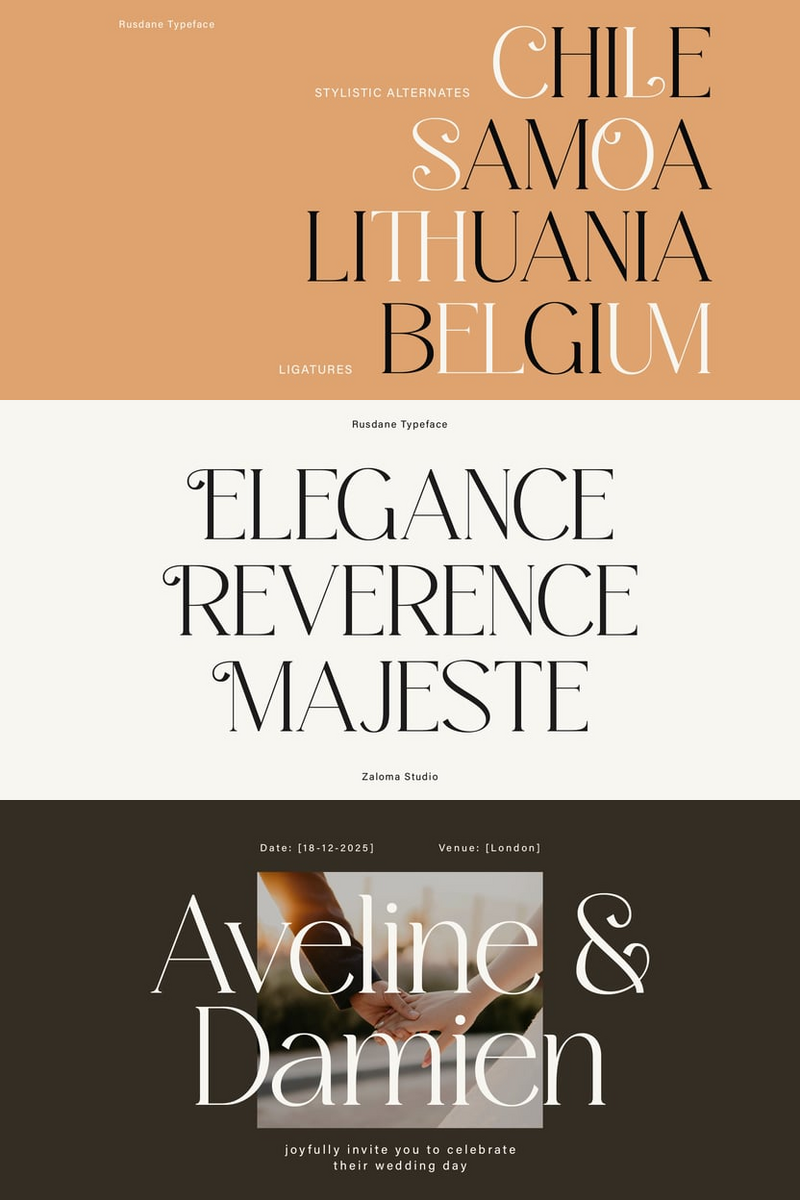
Ready to Disrupt? How Rusdane Font's Edgy, Rebellious Vibe Helps Startup Tech Brands Forge a Distinctive Visual Identity Across Dynamic Website Headers, Sleek App Interfaces, and Bold Editorial Features.

Hey, fellow innovators! You're building something revolutionary, right? So why settle for a 'safe' font that lets you blend into...