My intrigue deepened as I encountered the Hebrew typeface, jaffa, by the Idźkowski & Sk-a foundry. Its echoes of "a.r." in Hebrew script were undeniable. Collaborating with Ben Nathan from Israel, we embarked on a quest to encompass diverse scripts. Greek and Vietnamese soon found their place in the narrative of Polin Sans.
This typeface is more than a mere collection of letters—it's a historical voyage through the nuances of Polish modernism. Designed by Mateusz Machalski and Ben Nathan, with invaluable contributions from Michał Gorczyca and Małgorzata Bartosik, Polin Sans stands as a testament to the fusion of cultures and aesthetics. Each character whispers stories of its origin, weaving a tapestry of artistic endeavor across borders and time.
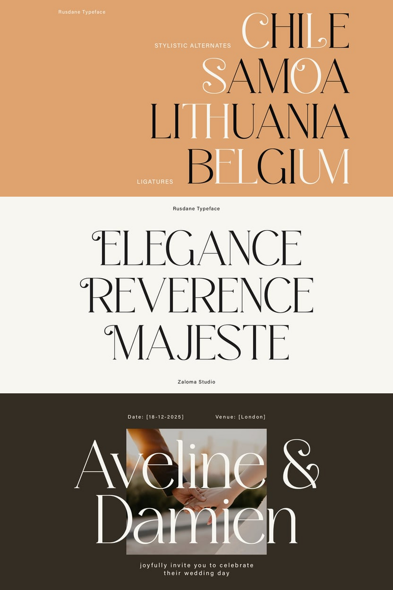
Upgrade your typography with this font!


No comments:
Post a Comment