The Problem: Striking the Balance Between Classic and Contemporary
In today's digital age, finding a font that balances the elegance of classic design with the crispness of modern aesthetics is a challenge. Designers often grapple with typefaces that either look too old-fashioned or lack personality. This struggle is real: how do you inject character and warmth into your work without compromising readability or professionalism?
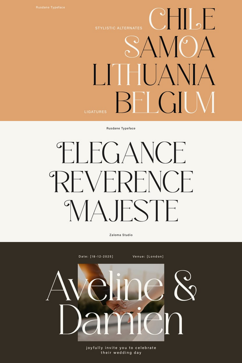
Meet SFT Schrifted Serif: Your Typographic Solution
SFT Schrifted Serif is here to solve this dilemma. Inspired by the visual richness of Stockholm's districts, particularly Gamla Stan and Södermalm, this font family brings a unique blend of historic charm and contemporary style. Think of it as your design’s secret ingredient, adding a touch of romantic elegance that draws the eye and captures the heart.
Why SFT Schrifted Serif?
Visual Harmony: This font is constructed with smooth, graceful curves and rounded closed shapes that mimic botanical motifs. These details create a sense of lively movement, making your text not just readable, but visually delightful.
Versatility: With three optical sizes—Text, Display, and Subhead—SFT Schrifted Serif is suitable for a variety of design needs. Whether you’re crafting a detailed body text, an expressive headline, or something in between, there’s a perfect fit for every project.
Extensive Language Support: Covering an impressive range of Latin and Cyrillic languages, this font ensures your message can be communicated globally, maintaining its charm and integrity across different scripts.
Handling Common Objections
“But will it fit my project’s theme?” Absolutely. SFT Schrifted Serif’s design flexibility makes it ideal for both traditional and modern themes. Its romantic, organic aesthetic is perfect for projects that aim to evoke emotion, while its structured form ensures clarity and professionalism.
“Isn’t it too ornate for everyday use?” Not at all. The beauty of SFT Schrifted Serif lies in its balance. The Text variant is specifically designed for smaller sizes and longer passages, ensuring readability without sacrificing style.
How to Make the Most of SFT Schrifted Serif
Pair Wisely: Combine SFT Schrifted Serif with its sibling, SFT Schrifted Sans, for a harmonious typographic palette. The sans-serif counterpart offers a clean, modern contrast that complements the serif’s elegance.
Experiment with Sizes: Use the Display size for headlines to make a bold statement, the Text size for body copy to ensure legibility, and the Subhead size for smaller headlines or emphasized text.
Embrace the Details: Let the font’s botanical motifs and graceful curves shine in designs where detail matters. Invitations, branding, and editorial projects are perfect canvases for showcasing its unique charm.
A Font That Speaks Volumes
Incorporating SFT Schrifted Serif into your design arsenal means choosing a typeface that tells a story—your story. Whether you’re aiming to evoke a sense of history, romance, or a dynamic modern vibe, this font family adapts and enhances your vision. So next time you’re in search of that perfect typographic balance, remember the enchanting streets of Stockholm and let SFT Schrifted Serif guide your way.
Stay connected with us on Instagram @schrifteriafoundry for more updates and inspiration. For customization, font files, or any questions, reach out to us at info@schrifteria.xyz. Let’s bring your designs to life with the timeless elegance of SFT Schrifted Serif!
Don't miss out on this amazing font!


No comments:
Post a Comment